I’ve been in the recording studio with Tez Skatchill a couple of times lately while he was recording his new single ‘If I question’.  Recording studios are great places for photography because you get the emotion from the artist and an unusual environment especially the mixing desk.  These shots were taken at SSR, Manchester with Sara De Clara on the desk.

I used a couple of wireless flashguns for these shots; one inside the booth and one in the studio.  The other thing you need is a good duster!  There are two layers of glass between you and the artist and they are invariably filthy.  A polarizer is also a necessity.  Shots in the studio lend themselves to effects such as colour tones, cross processing and strong B&W contrasts.  I suppose it’s having the ‘cover art’ in the back of your mind that helps you be that bit more creative.  Obviously you can take cover art much further than this but that wasn’t strictly the purpose of the shoot.  Great fun though…..

My new website

Posted: November 25, 2014 in Uncategorized

Jeff Hurst Photography is now live at: jeffhurstphotography.wordpress.com check it out!  Comments welcome.

More First Friday pictures

Posted: November 25, 2014 in Uncategorized

I’ve been to two more First Friday events at West Heaton since the last post……just a bit slow blogging about it!  Anyway here’s a selection of pictures from the last two nights and in no particular order we have: Whiskey River, Rory Ellis, Lazlo Baby and Tez Skatchill.  I’ve been in the recording studio with Tez Skatchill shooting pictures for an EP but more about this later.

First Friday at West Heaton

Posted: September 9, 2014 in Uncategorized

On the first Friday of every month West Heaton throws it’s doors open to local (or not so local) artists.  This month there were three female singer/songwriters, these being Risa Hall, Little Rach and Zoe Mulford.  It was a great evening of really very good music and quite varied.  Zoe Mulford’s lyrics have a clever element of humour about them; I don’t mean comical – more Elvis Costello than Bob Newhart, Little Rach is very emotive live and totally wrapped up in every song and Risa Hall has a more powerful delivery.  I even came away with a new CD.

All the photos were taken without flash.  I used a range of filters in camera and post processing just for the fun of it!  It’s still difficult to beat good old B&W though.  As it was an acoustic, seated gig I only used a couple of angles so I wasn’t dodging in front of everyone but I’ve got a reasonable selection of shots, mostly of the artists but some more self indulgent stuff just for me; live music events are great for capturing something different.  I started with the high speed drive on to capture the emotive moment but turned it off as really all you need to do is listen to the song to know when that moment will arrive!

Anyway, here’s a selection from the night…..enjoy.


Going to see ‘Finding Vivian Maier’ today.  Vivian Maier was a nanny who  took over 100,000 photographs that were hidden in storage lockers and, discovered decades later and is now among the 20th century’s greatest street photographs.

Her body of work came to light in 2007 when it was discovered at a local thrift auction house on Chicago’s Northwest Side.

I’ll report back later…….

Later…..

Vivian Maier was born in New York but spent most of her youth in France.  She came back to New York to work as a nanny.  Working as a nanny, her Rolleiflex was always round her neck and she would take the children to all sorts of places taking thousands of pictures in the process.  She had an uncanny knack of getting very close to all sorts of subjects.

Her photo’s were bought at auction by John Maloof who was looking for some historic photos of Chicago.  Since then he has spent the rest of his time piecing together her life; developing and printing thousands of rolls of film in the process.  Maier also shot a lot of self portraits, cine film and recorded audio tapes so you could get an idea of what she was actually like.  Interviews with the children (now grown up) were interesting.  There were very mixed memories of this very private lady who seemed to have a darker side.

A fascinating documentary about a very private person who probably would not have wanted all this attention.  Well worth going to see.

The Still

Posted: July 28, 2014 in Uncategorized

Trying to book the Still for a do at the tennis and squash club.  Great fun…here’s a couple of pics I took at my birthday bash.

commercial shots

Posted: July 28, 2014 in Uncategorized

I’ve been putting together a few commercial shots lately in lieu of my website being taken down for improvement.  I’m also finding Flickr a bit of a pain so I might have to invest more time in Facebook!  Time for a change……

Epiphany

Posted: May 7, 2014 in Uncategorized

I haven’t blogged much lately.  I’ve spent the last few months working on the new (old) house.  However, I recently had an epiphany about one of the major attractions for me in a photograph that I hadn’t really realised was such an influence on my style until recently…..so I thought I’d blog about it!  In my previous post I talked about a recent exhibition where I was drawn to the shots with limited colour palettes.  This got me thinking and I started looking back at some of my favourite photographers/images from the past and indeed my favourite shots that I have taken.  Interestingly the limited colour palette comes up again and again.  Work by Ernst Haas and Saul Leiter are both examples of this;

photo-by-saul-leiter-02[1]

05Leiter[1]

ernst3[1]

2-web1[1]

The top two images here are Saul Leiter and the bottom two are Ernst Haas.

In my last post I  singled out Mark Power and Peter Marlow’s work in ‘Open for Business’ and these shots also have limited colour palettes and even in my own work I seem to lean toward this almost subconsciously.  The next two shots I took a while back mainly for their subject and form but the limited palette must have also registered with me and I have countless examples of this.  I studied colour under various ‘OCA’ modules but it’s another thing to realise the extent to which it impacts on your own work.  It has less to do with combinations of colours and whether they are complimentary or not but more on the range of colour in an image.  It’s not a hard and fast rule but a definite tendency and influence.

SONY DSC         SONY DSC

This goes further with the complete tone of an image and this seems to come mostly from film; what I can only describe as ‘the Kodachrome look’.  Photographers such as Stephen Shore and William Eggleston have produce these kind of images that have a whole atmosphere created by the overall tone.  This seems to be created using a combination of time of day and film stock.

I think I’ll be keeping an eye out in future to see how I use colour in the way that I do (rather subconsciously) and I intend to make this far more conscious in future.


A couple of weeks ago I visited 3 exhibitions in Bradford with a couple of OCA pals.  The most interesting of these was ‘Open For Business’.  For this exhibition Multistory and Magnum Photos commissioned nine of the worlds leading photographers to document contemporary British manufacturing, exploring the condition of Britain’s manufacturing future.  Three bodies of work stood out for me………

Stuart Franklin documented costal related industries focusing on the construction of the aircraft carrier ‘HMS Queen Elizabeth’, wave machines of the Orkney Islands and wind farms south of Glasgow.  All of Franklin’s images on display were large black and whites.  The image that I found most striking was ‘Pelamis wave machines, the Sound of Hoy, Orkney Islands’.  The image is of the wave machine from the front looking like a whale surfacing for air with the water rushing from its mouth.  Never having seen a wave machine like this it looks almost static in the water but, in fact, forms a long sausage shape that moves with the waves.  I had to Google it (probably like many others) just to see what it looked like.   A powerful image of power generation; the big swells giving a clue to the size of the wave machine.  It is also a very sharp image considering that it must have been taken from a boat that was also moving in the swell.

Pelamis wave machines, the Sound of Hoy, Orkney Islands


Peter Marlow uses natural light where possible.  A number of his images focussed on steel fabrication in the black country.  As with Stuart Franklin I was seeing shapes and forms that are unfamiliar, allowing my mind to wander.  The greatest appeal for me was the limited colour palette in these images.  There were rarely any more than one or two colours evident, almost like Photoshopped partial colour images.

peter marlow 1

I also enjoyed Mark Power’s work.  I liked the way it was presented and I liked the predominantly dark images focussing on small details giving a degree of intimacy that felt like I was seeing something not picked up on before; like I was getting some kind of privileged insight.

Mark Power 1

Mark power 2

What didn’t I like?  I’ve never been a great fan of Bruce Gilden and here we see more of the same!  A camera shoved in someone’s face, harsh lighting and features, wide angled and unflattering.  It’s Bruce Gilden doing what Bruce Gilden does and didn’t really add anything to the exhibition for me.


Arles In black

I don’t need an excuse to visit the South of France but if I did  ‘Les Rencontres d’Arles’ would be perfect.  Add to this an OCA study visit and a chance to discuss things with fellow students and tutors and I couldn’t say no. This year the theme, Arles in Black, referred to a predominantly black and white collection and I was a bit worried that this might be too much on such a scale. My fears were born out to a degree as, at times, I was desperate for some colour.

As I said it was great to mix with others.  Some I already knew and some I now know!  Being able to discuss things and bounce ideas around makes the world of difference – even if it is only ‘how do you pronounce Becher’?  Arles itself uses every available space to create exhibitions; galleries, churches, hotels and cafes all have work on display.  The biggest single venue is the Parc des Ateliers which used to be a collection of workshops for railway maintenance.

As usual, Arles provided me with a wealth of work I’d never seen and some new photographers to follow up on, some of whom are already influencing my next assignments!  There was far too much to go into detail on everything I saw but here are a few highlights:

John Davies had a collection called France England which was a mix of landscape and industrial landscape shots taken in the UK and France.  Having travelled from Stockport I was quite surprised to see a picture of Stockport viaduct (a picture I’ve taken myself, from the same spot) staring me in the face.  I’ve since revisited a number of his images around Stockport but that’s for another post!  All of the prints were beautifully produced with the fine detail that you get from a large format film camera and a wide range of tones but with a strong contrast and strong blacks.

‘Hulme Manchester 1984’ was the image that fascinated me the most.  I drove past these flats every day for many years before they were knocked down and it was never as quite as this.  This image almost feels like an artist’s impression of the future of housing; everything orderly and neat.  There is, however, the corner of a fence in the bottom left which suggests that it was taken from something that was not quite finished.  A number of Davies’ images, including this one, place the horizon in the middle with a large expanse of sky which I feel may unbalance these images.

John Davies - Hulme Manchester 1984

John Davies – Hulme Manchester 1984

I kept looking at ‘Agecroft power station, Salford 1983’ wondering where I had seen this before.  I then realised that it put me in mind of Mitch Epstein’s ‘Poca High School and Amos coal power plant 2004’ taken 21 years later.  Agecroft power station is one of those images that has a wonderful sense of delay.  The longer you look at it the more you see.  Discussing the image with others on the study visit was interesting as people picked up on different aspects of the image from the people in it to the way industry had shaped the landscape.

John Davies - Agecroft power station

John Davies – Agecroft power station

A large number of these images will form part of  ‘all that is solid melts into air’ Manchester Art Gallery from 11 October 2013 to 19 January 2014, Curated by Jeremy Deller.

Hiroshi Sugimoto had 2 exhibitions; Revolution and Colours of Shadow.  Revolution was in the Espace Van Gogh and was nearly all made up of B&W, night time, long exposure landscapes that were very large (94 x 47 inches) and presented on their side.  Without reading about them in advance they immediately look abstract because of their orientation.  Once you realise they are on their side it is difficult not to turn your head.  That said, a photograph for me can be as abstract as it likes, I find shape, form and colour as fascinating as a more obvious and defined subject.  In some ways I wished I’d not turned my head at all.   There is no point of reference for where the images are taken, no foreground, so they present a sense of floating in the air.  I found the images very calming and felt I could get lost in them.

Revolution

Revolution

Sugimoto’s second exhibition, Colours of Shadow was quite different.  Colours of Shadow is a series of Polaroids taken early in the morning through a prism, splitting the colours.  These Polaroids have been used by Hermes for a series of silk scarves and these were displayed along with the polaroids in the Eglise Saint-Blaise.  I was expecting prints but the scarves captured the light from both sides adding a new dimension becoming illuminated and vivid beacons against the pale yellow stone of the church walls.  The church setting was enhanced by Sugimoto’s ‘Last Supper’ which hung at one end.  The central runway created a catwalk with the scarves just out of reach.  There was an overall sense of worshipping the scarves (which retail for many thousands of pounds each).

Colours of Shadow

Colours of Shadow

Gilbert Garcin’s humorous and at times sarcastic images of life’s struggles were a well needed lift to the end of day 2; that point when you have seen enough in one go and are getting weary.  Garcin uses himself as the main character in his images resulting in a Monty Python meets Monsieur Hulot feel.  These pictures are created using mostly cut outs and models rather than Photoshop.  The images tend to stand or fall by their title.  The image below ‘Life’ see Garcin going round in circles with his cross to bear only to be buried under it.  I found myself playing guessing games trying to work out the title from the image before reading it.

Gilbert Garcin

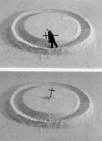
Gilbert Garcin – Life

There were many other artists and photographs that inspired me including Guy bourdin, Antoine Gonin and Wolfgang Tillmans but I think I’ll have to follow these up in future posts.